Choosing a focused path to follow throughout one’s college education can be a daunting task. It has been the primary conflict in many films, tv shows, books, and has occupied many family dinner conversations. This theme has been closely explored from another perspective too: media focused on underdogs. You know, kids from “the other side of the tracks?” The cards are stacked against them; they usually beat all odds via a less traditional route and the crowd cheers. Then there are people like me. I am not sure what you would call my journey leading up to and into college; probably something closer to the latter trope. It would be reasonable to liken it to a dark comedy—think Wes Anderson films, but everything really did happen that way. I am thankful for laughter. It truly is good medicine.
Childhood, teenage years, and early adult years were all spent expecting to die soon (for various reasons) and at various times, they were also spent trying to die. As you can imagine, and perhaps have experienced for yourself, that can make it difficult to ideate about the future. So, how on earth did I end up full of life, not only in college, but with full assurance that Digital Design is the field for me? That’s a longer story, but it all begins and ends with Jesus Christ, the Alpha and Omega, the Way, the Truth, the Life, the One who died to pay my debt of sin and rose from the grave to reconcile me to Himself. So then, my life is His and what He wants me to do, with the help of His Holy Spirit, I do. In this case, that is digital design in college.
In digital design, I bring my wonder, my critical eye for detail, my people-watching observations, and my problem-solving skills to the table. I have a good eye for color, movement, shape, structure, and intuition for curating designs specific to the person, community, or business for which I am creating. I love swinging through my senses archives to pull up whatever stored data would prove useful for any given project. My aim is to remove barriers, to get straight to the heart the matter and to the hearts of the people.
why is inclusive design important for digital designers to understand?
The answer to this question lay in the name ‘designer’. Anyone, anywhere creating anything for people to use must begin with the understanding that each human being is unique. As such, they have differing needs, desires, and ways of adapting to their environment. Everyone has varied abilities and different limitations. To bypass this reality, is to waste resources designing something for someone that may not exist.
Once digital technology is introduced to the picture, more opportunity to create inclusively unfolds, but at the same time, more opportunity to create exclusively presents itself—especially when one can get it done quickly, or struggles to differentiate who is having to adapt: them, or the technology. If digital designers hope to solve real problems in a meaningful way, then they need to listen and learn from a range of differently abled people trying to achieve similar goals.
why are empathy exercises helpful for designers to conduct?
As human beings, we adapt. We can get so used to adapting that we do not even know we are doing it. This can be a strength in so many areas. However, when it comes to design, the whole point is to make an experience better for someone, so that they do not have to adapt so much. We want to free up cognitive load and enable people to soar to new heights. For this, we must know the people and understand in a relational way, through empathy, what they actually face and how they have learned to cope. Only then, through this practice do designers begin to get to the heart of the matter. Only then are designers empowered to design the right thing for the right experience for multi-faceted people. One way these relational moments and revelations are fostered is through empathy exercises. An intentional, focused practice that enables designers to search, dig, uncover, try, test, and reflect on what people are actually experiencing—both on the actual problems and the problems with the solutions. Then designers can do the work of finding what actually helps.
5 empathy exercises—
The following exercises are all directly from Microsofts Inclusive Design Toolkit.
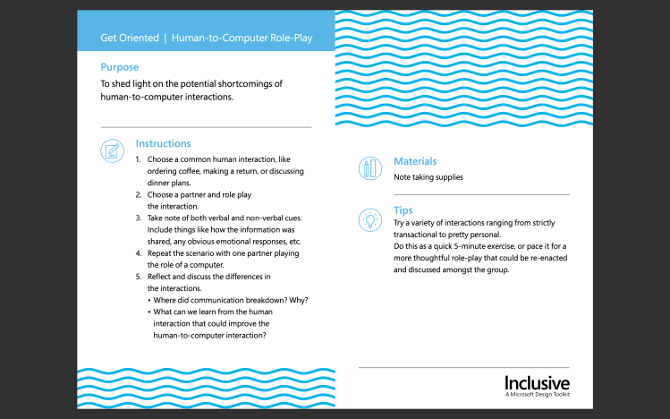
Get Oriented | Human-to-Computer Role-Play is meant to help designers see areas where computer to human interactions may be lacking. For this exercise I role played discussing dinner plans, which is an ordinary human interaction with another person. First, as a human to human interaction and, second, as a human to computer interaction. My partner played the role of computer in the second round. While interacting with the ‘computer’ I had to make many adjustments to my body language and speech to find the answers I was looking for. In the end, I still came up shorthanded, realizing it would be easier to solve the dinner question on my own. The computer was useful in-terms of presenting some options, but it was not able to interact with me on equal footing.
In some of my prior design work, like working on an app, I have frequently wished that the tech could anticipate what users are trying to accomplish and help them through questions and prompts. Along the lines of Amazon’s AI chatbot, which asks questions and offers pre-scripted answers that actually are usually correct. It makes communicating with the computer effective and usually has helped me accomplish my goal as a user. Through this exercise I learned that these desires I have had as a designer and and as a user were also my pain points in having a human interaction with a computer.
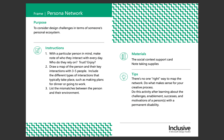
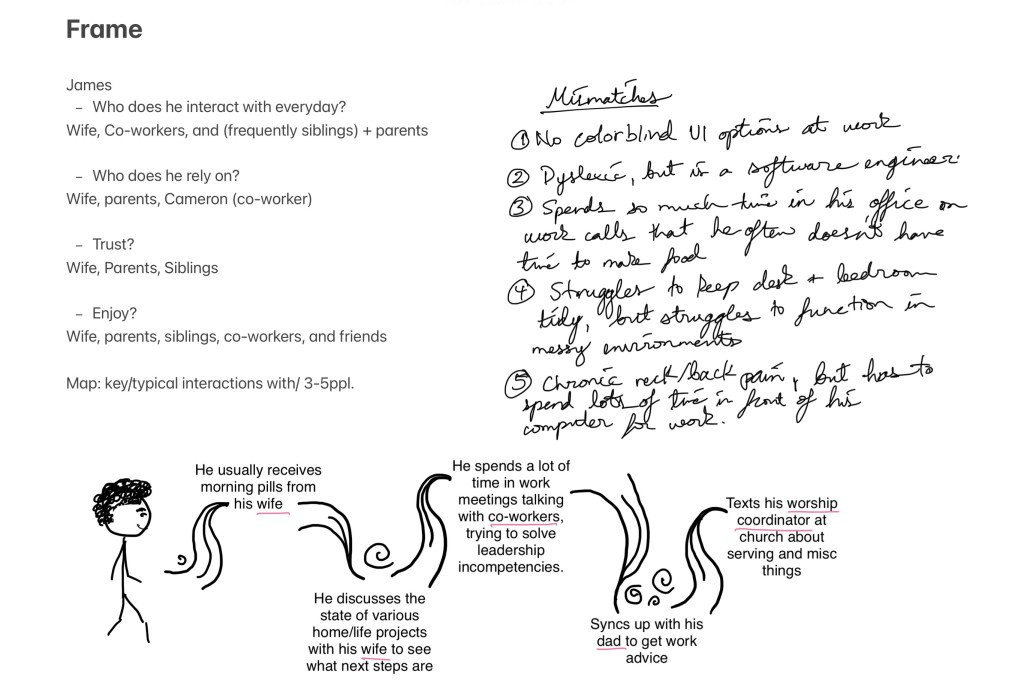
Frame | Persona Networkis meant to reveal what parts of a design are actually challenging for users by observing how someone functions in their ‘personal ecosystem’. How do they adapt? What are their frequent interactions? For this exercise I observed a person (to whom I have given the name James) and noted his daily interactions, as well as who he relied on, trusted, and enjoyed. Afterwards I made a map of important/routine interactions he has with 4 people. From all this observation, I was able to derive various mismatches that exist between him and what/whom he interacts with everyday. This took into account his permanent disabilities, as well as temporary and situational limitations. In prior design work, I often have not designed with color blind accessibility in mind. This has made me aware of just how many people are colorblind—I did some more research after observing James. 1 in 12 men and 1 in 200 women are colorblind (Gitnux, 2023). Certainly, this encourages me to design with color-blind options in mind.
Phase 2—Frame | Persona Network
Notes and Sketches for Frame exercise
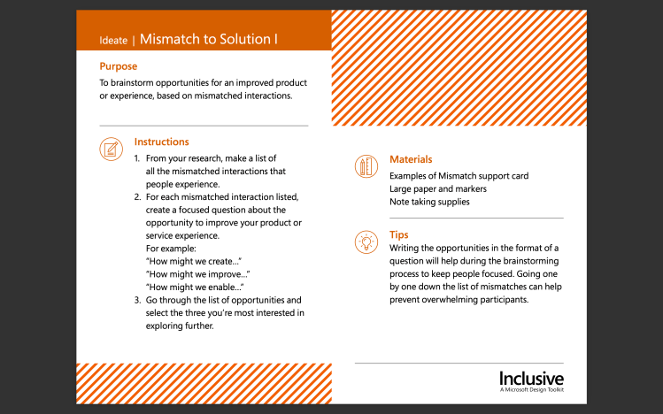
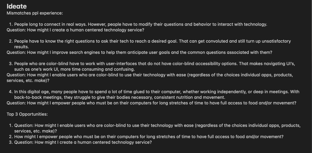
Ideate | Mismatch to Solution 1 asks designers to brainstorm areas where a product or experience can be improved by looking at mismatched interactions. For this exercise I listed some mismatches people experience. Afterwards, I created complimentary questions addressing those mismatches in an effort to find ways to improve my product. In some past design work, I have been part of groups where do this kind of activity for each others designs. We asked questions, probe for potential holes and problems where users may experience exclusion or discouragement using the design. Then, ask more questions about how we could improve, create, enable, etc. a user to use the design in a way that works for them. From this specific exercise, I learned how to recognize mismatches more easily.
Phase 3—Ideate | Mismatch to Solution 1
Notes on Ideate exercise
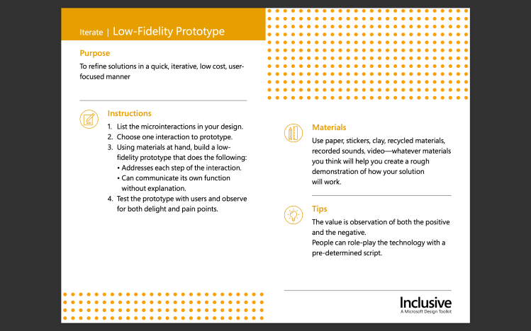
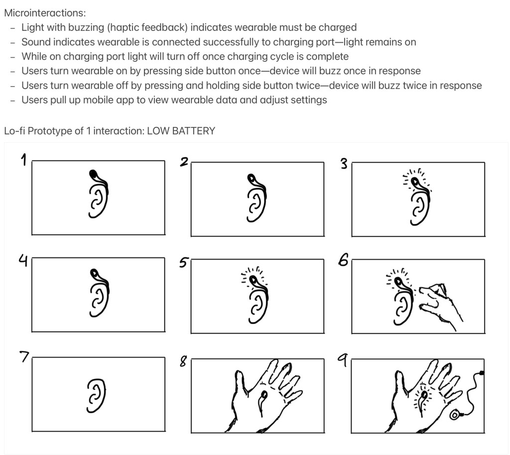
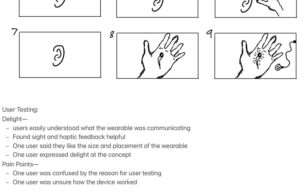
Iterate | Low-Fidelity Prototype helps designers create solutions for user-testing in a way that reserves time-investment and resources. For this exercise I listed micro-interactions in my design and chose one to prototype. From their I created rough sketches of every step of the low-battery interaction users would have their wearable. Then I conducted user-testing to observe delight and pain points. Knowing those helps designers identify potential improvements. Similarly to the Ideate exercise, my prior design work always includes a low-fi prototype phase and user testing as those are essential to catching issues early on and having enough time to fix them. From this exercise I learned a new term: microinteractions.
Phase 4—Iterate | Low-Fidelity Prototype
Question and ProductMicrointeractions and PrototypeUser testing outcomes
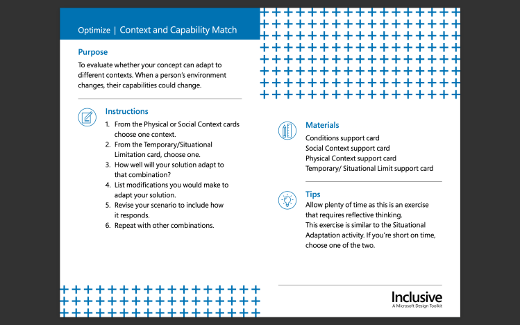
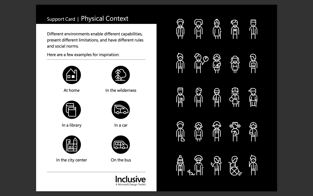
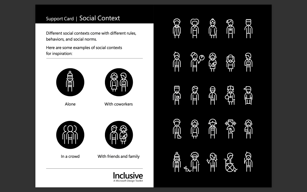
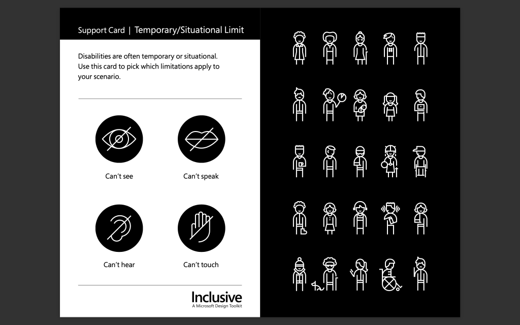
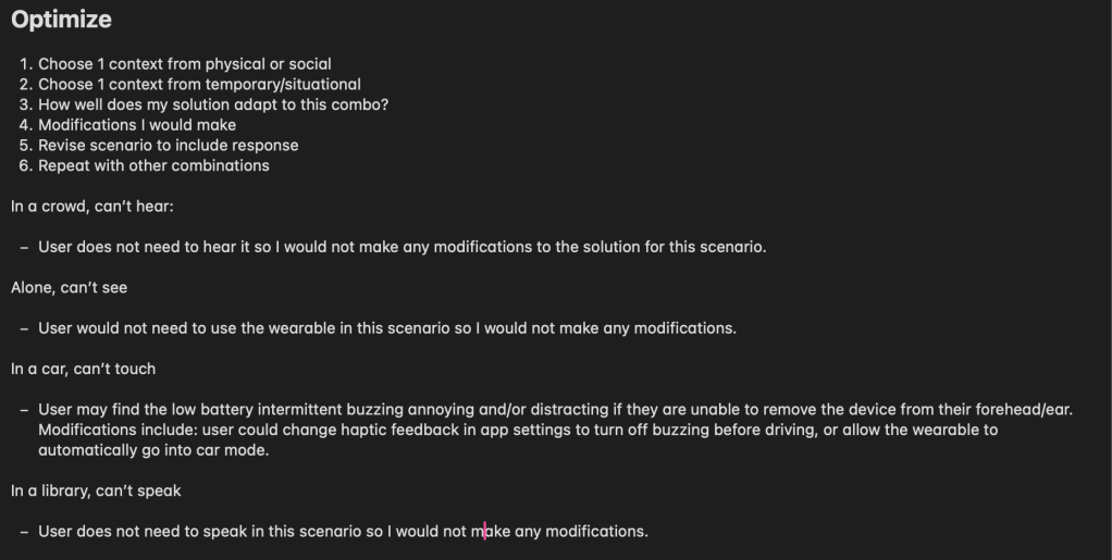
Optimize | Context and Capability Match helps designers evaluate if their solution/concept can adapt to other contexts because context changes can change a person’s abilities for a time. For this exercise I used the support cards below, which Microsoft provides, to create various scenarios. Then I tested each scenario to see how my solution would adapt to it. I also thought of various modification that could be made to my solution when it did not adapt well a given scenario. This exercise is similar to tools I have used in my design work when considering how different kinds of people in various situations can interact with my design. I really enjoyed this exercise because it helped me think specifically and simply about real ways users may experience issues with the product as they go about their day. I may employ this or something like this in the future to help me identify holes.
Phase 5—Optimize | Context and Capability Match
Conditions Context Support CardPhysical Context Support CardSocial Context Support CardTemporary/Situational Limit Support Card
Notes on Optimize exercise
Takeaways
My biggest takeaway is that while not all of these exercises will be useful for any given project, the overall framework is. I also now know that I can draw upon Microsoft’s Inclusive Design Toolkit for my future designs as I think and work through them, which is pretty cool!
References
Microsoft. (2016). Microsoft Inclusive Design | Inclusive Toolkit Manual [Pdf].